
What does “normal” look like when it comes to process equipment?
Troubleshooting process equipment has been the hallmark of my career when I worked as a Process Engineer. I’ve always thought that before you can identify a problem with the equipment, you need to know what “normal” looks like. What is the normal pump output? What is the normal tank level? What is the normal speed of rotation of this agitator? What is the normal temperature that this bioreactor runs at? What is normal?
In previous roles as a Process Engineer, I found the process trending and simulation tools by #aspentech indispensable. Using Aspen Process Explorer, I would quickly chart any number of process equipment characteristics. Some of the trends I most frequently pulled included flow, pressure, temperature and speed. I always considered these parameters baseline trends. I would build displays of these trends that made sense to not only me, but to others on my team. Color coding was essential, especially if I wanted to highlight a particular process parameter that was most critical.
The cool thing was whenever there was a process upset or power outage, my eyes had already been trained to recognize what “normal” was.
With process trends, I could go back and forth to the “normal” time period and compare to the upset conditions time period.
Using Aspen Process Explorer cut down my troubleshooting time in half in some cases. Because I was able to quickly pinpoint which of the process trends was “off”, I could then take the next step to drill down into the root cause. The sooner I was able to identify the root cause, the sooner we could implement remediations or solutions that worked the first time.
But as they say pictures tell a thousand words, right?
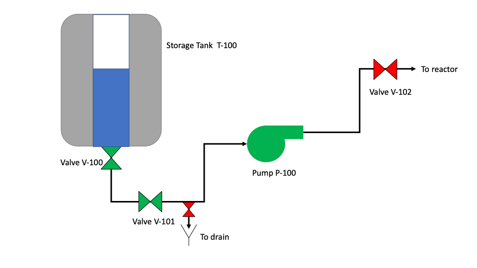
Pictures (or graphics in this case) allow you to tell a story about the process.
Aspen Process Explorer has this cool feature that allows you to build graphics. My motto for a long time was, if you can trend it, then you can build graphics for it.
Being able to build graphics, even simple ones, was a game changer. The process trends looked like a “picture”. I could now take this “picture” and present my root cause analysis to Management, to Quality Assurance, to Safety, and even to non-technical roles in Supply Chain and Sales. It was a picture. Everybody could clearly see where the process upset was.
See! See that red valve on the top right there? Well, that valve should actually be green. Clearly, this valve should have been open during this step in the process, but it wasn’t and that’s why we had a failure. See, everybody? Yep, got it (heads nodding in agreement).
Having built process trends and graphics for 13+ years, I was very adept at coming up with creative ways to tell stories. Only one problem, some of the newer engineers in my team were not as well versed with this process. What’s the solution I came up with? Write it down, ofcourse!
Documenting the process of how to create graphics
I started writing exactly how I got from a blank screen to a screen filled with valves that changed colors from green to red to tell you it was open or closed. To tank levels that turned red from blue when the level got below the target set point. To pump speeds that turned green at optimal speeds. To conductivity meters that started blinking when the target conductivity was not met at the end of a Cleaning in Place (CIP) cycle.
The feedback I got from the engineers in my team was resounding. I never knew you could build graphics in Aspen Process Explorer. This would have saved me a ton of time had I known about this a few months back. You know what, I could have copied and pasted a graphic like this into my last deviation report; that would have saved me so much time. Can you build more?
The simple act of communicating a useful tool to my team had opened the doors to greater efficiencies across the board.
And then writing it all down, meant all this knowledge was now just a click away, instead of buried in my head.
With the written word, I had now empowered the entire engineering team to get to the root cause in record time.
So yes, while I do agree that pictures tell a thousand words, sometimes, you do still need to write it down.
Agree?
This article is also published on Linkedin.
